Skincare, sold in pharmacies
Pariclair
Logo, identity, applications, animated signature and website
See the projectTribal Print · Abidjan · 2026
We gave Tribal Print a single design: the website, social media, emails, videos, motion and sound all look and feel alike. Everything on this page is a real file.
Tribal Print is a brand from Abidjan, and it is our own, not a client’s. We unified it before offering the same thing to others.
The identity
Before the website, social media and videos, there is the identity: a logo, colours, lettering and pictograms. Everything else follows from it.
01
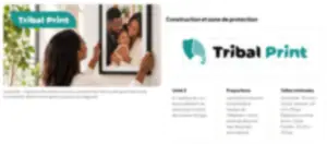
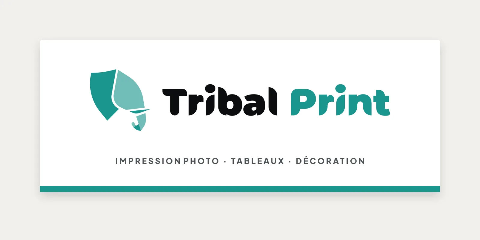
The elephant, a symbol of Côte d’Ivoire, has been with the brand since 2025. The name is written as two words: Tribal Print.
02
The elephant and the lettering from 2025 are kept. The name is now written as two words, “Print” turns turquoise, and the brand’s turquoises replace the two greens.
2025
2026
03
White, black, turquoise, a single colour: there is a version for every background.
Colour On black
 On turquoise
 Black
 White
 Turquoise
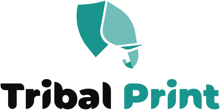 Vertical
 Elephant only
 Icon
 Name only
04
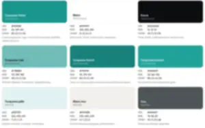
Nine shades, each with its role: turquoise signs, white breathes, ink gives structure.
05
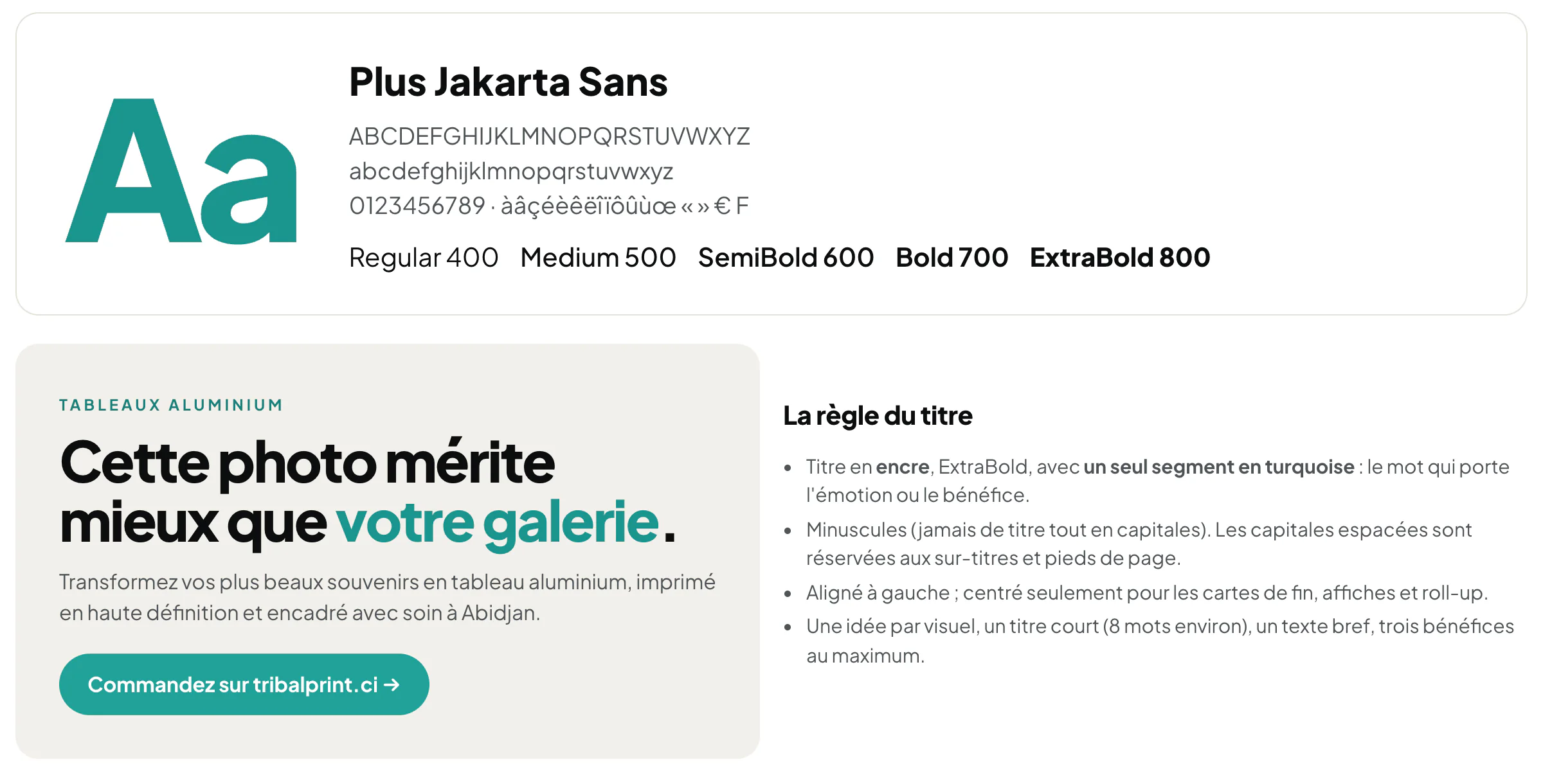
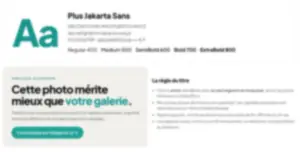
Plus Jakarta Sans, the one used on the website and in the app. A headline in ink, with a single word in turquoise.
06
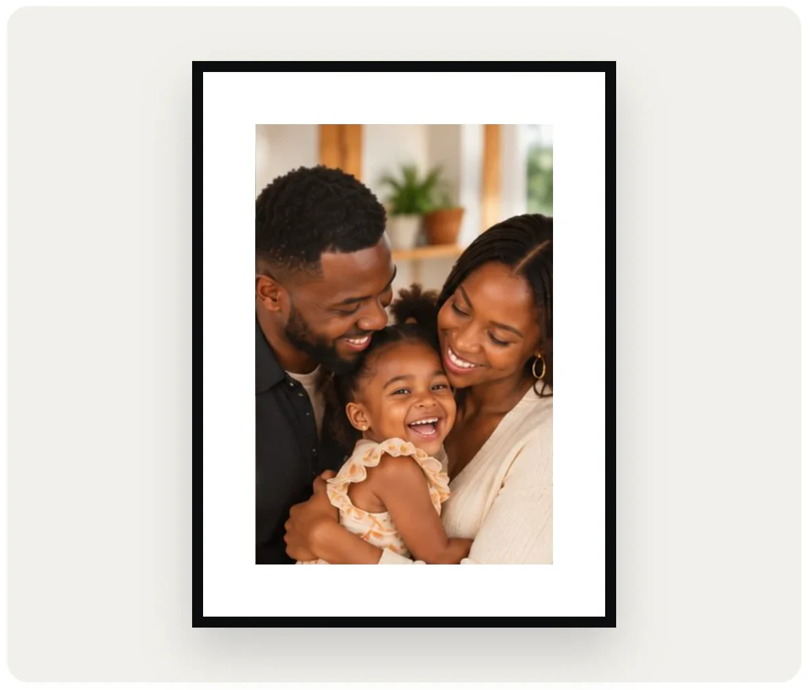
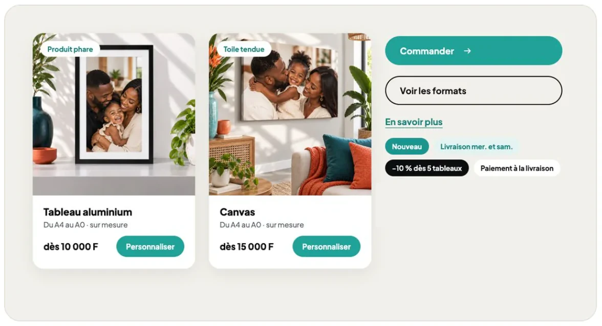
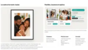
The black frame with its white mat, tabs, rounded buttons: these are what make a visual recognisable.
07
Drawn on the same grid, with rounded ends, each in a pale turquoise disc.
08
Jericho Print and Muslim Print are written with the same lettering as Tribal Print. Each has its own symbol and colour.
Tribal PrintTurquoise

Jericho PrintCopper

Muslim PrintAmber gold
09
A single document for everything that carries the brand’s name: the logo, colours, lettering, images, social media, video, sound. We only show a preview here: the detailed rules are handed over to the brand.
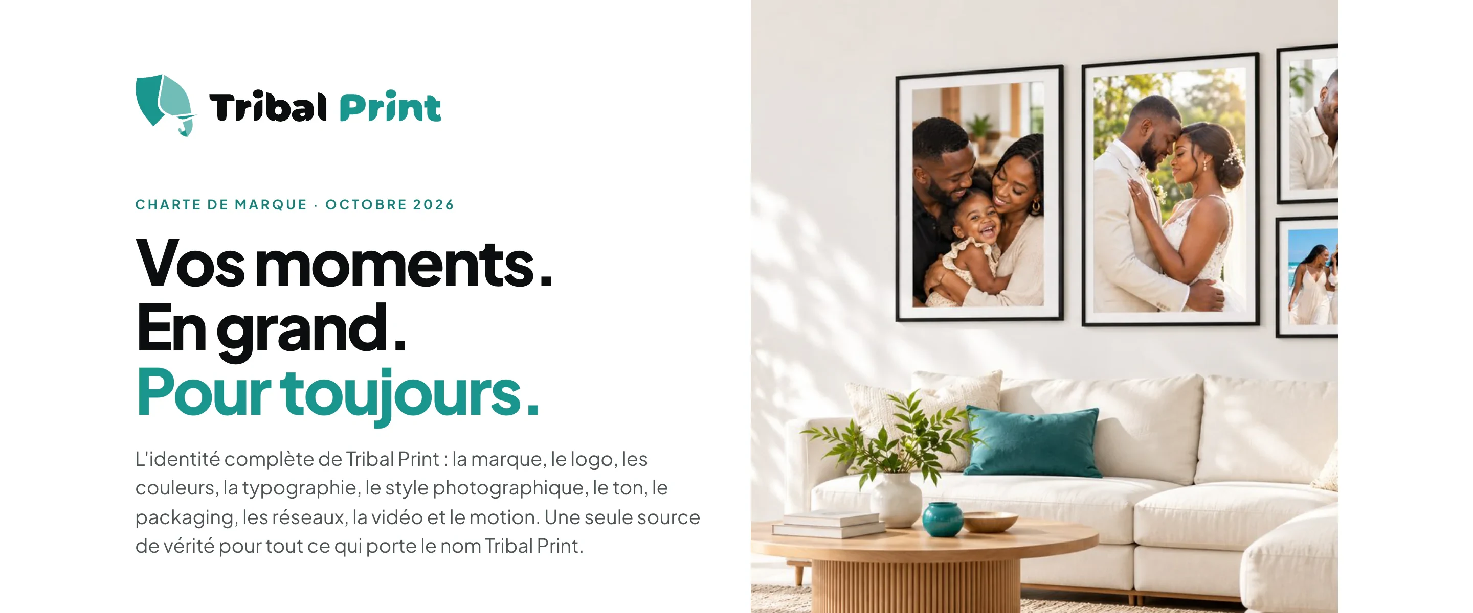
Preview only: the full rules are handed over to the brand.
Where we started
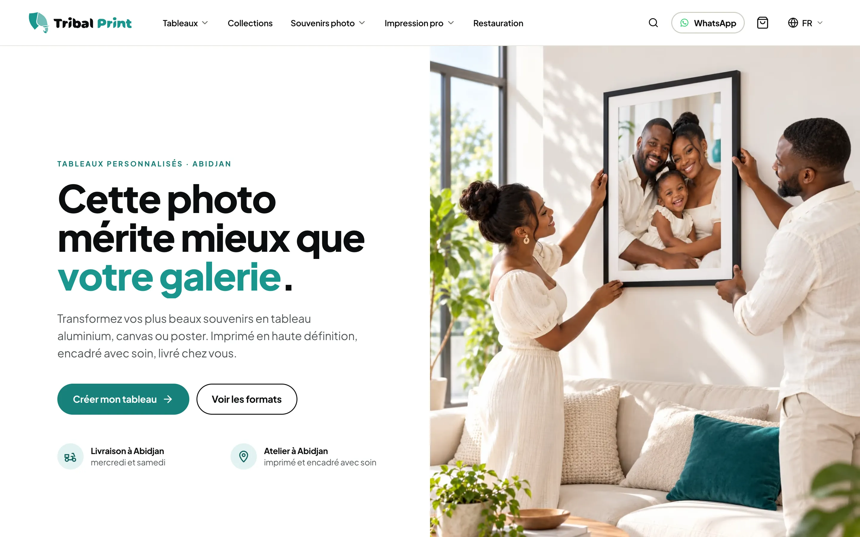
The Tribal Print website was already polished. The website, social media, emails and videos each had their own style: we unified the design and extended it to every medium.
A lovely shop, easy to browse, with a style of its own.
The website, social media, emails and videos each had their own look.
One design, the same everywhere, so the brand is recognised at a glance.
The website as it was online on 19 Oct 2026.
Before · the original website
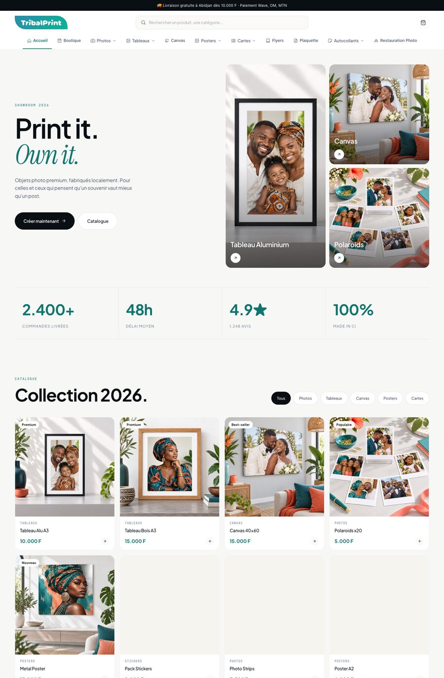
Before, after
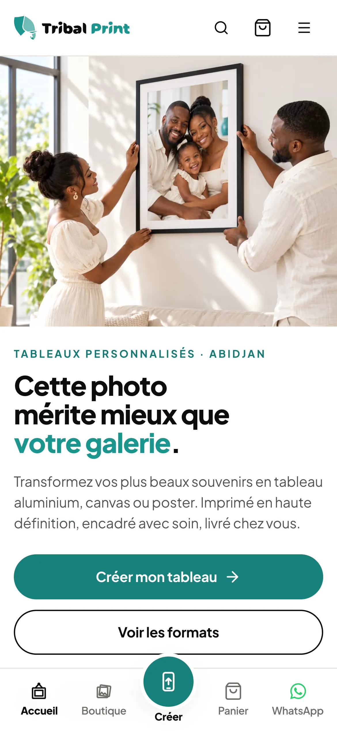
The same pages, side by side: first the original website, then the same website in the brand’s unified design.
Before · the original website
After · the same website, unified design
Tribal Print · Abidjan · 2026
The customer’s journey
A customer in Abidjan wants to turn a photo into a print. This is what they see.
They pick their print: aluminium, canvas or poster.
They send a photo from their phone and see a preview of the print before ordering.
They pay with Wave, Orange Money or MTN, the way they are used to.
The print is made in the workshop, then delivered to their door.
The price and the button stay in view as you scroll the page.
The brand everywhere
The logo, the colours and the way of speaking do not change from one medium to the next. That is why people recognise you.
01
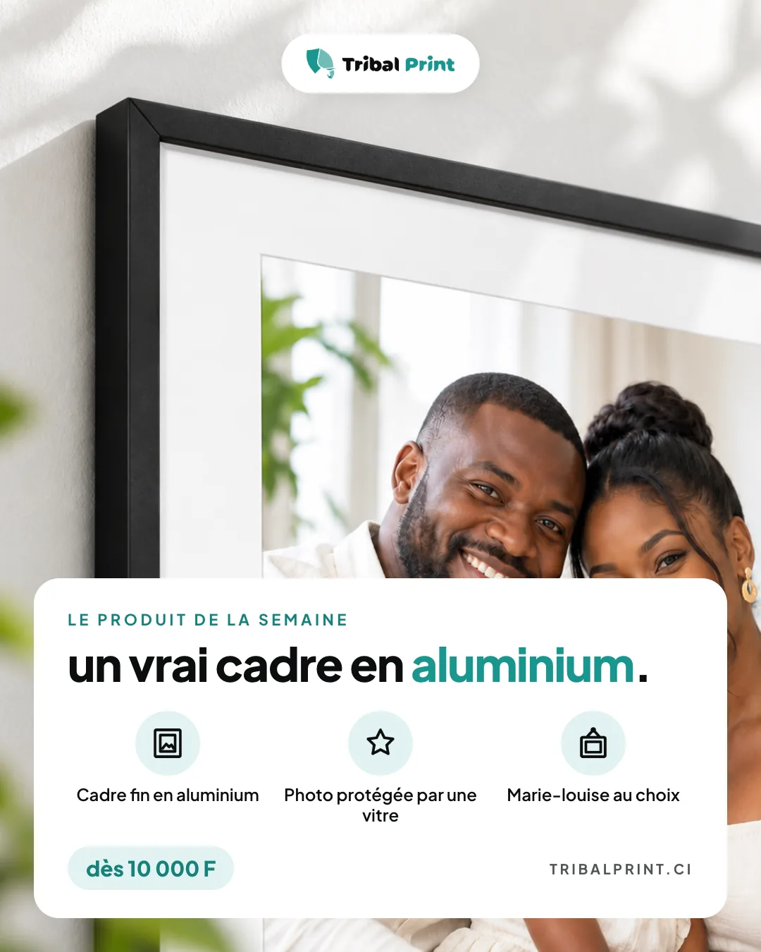
An Instagram carousel, a story, a post and a Highlights cover: the same design everywhere, with white cards, pictograms and turquoise accents.
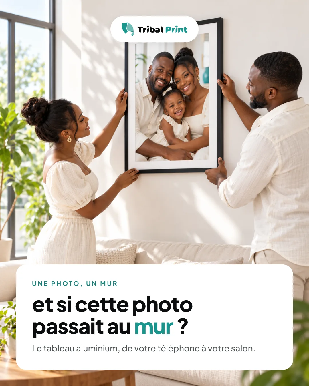
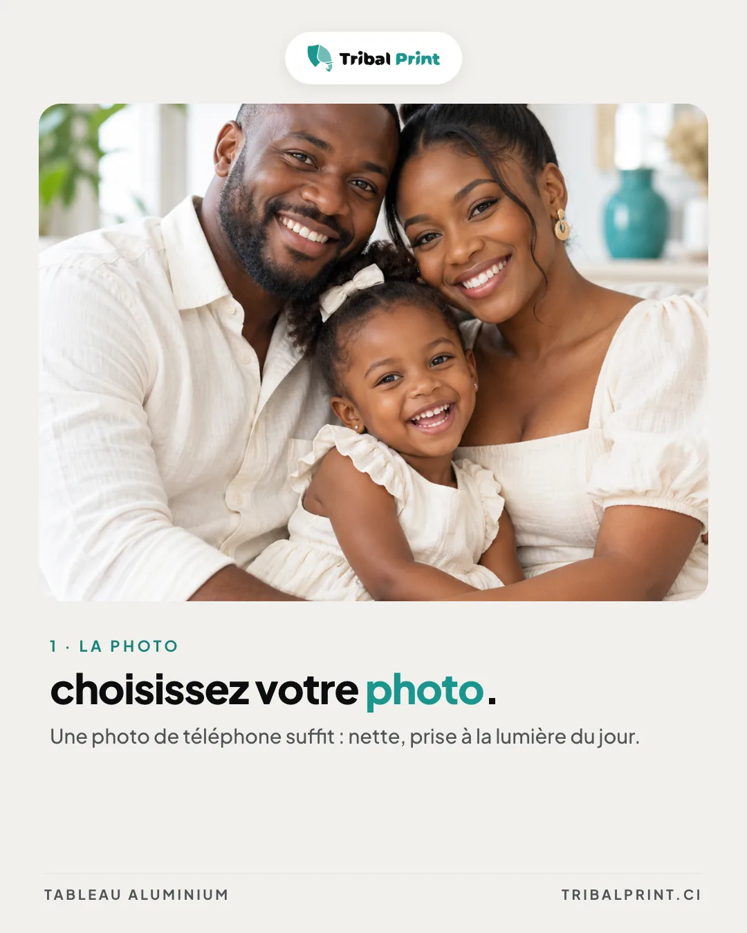
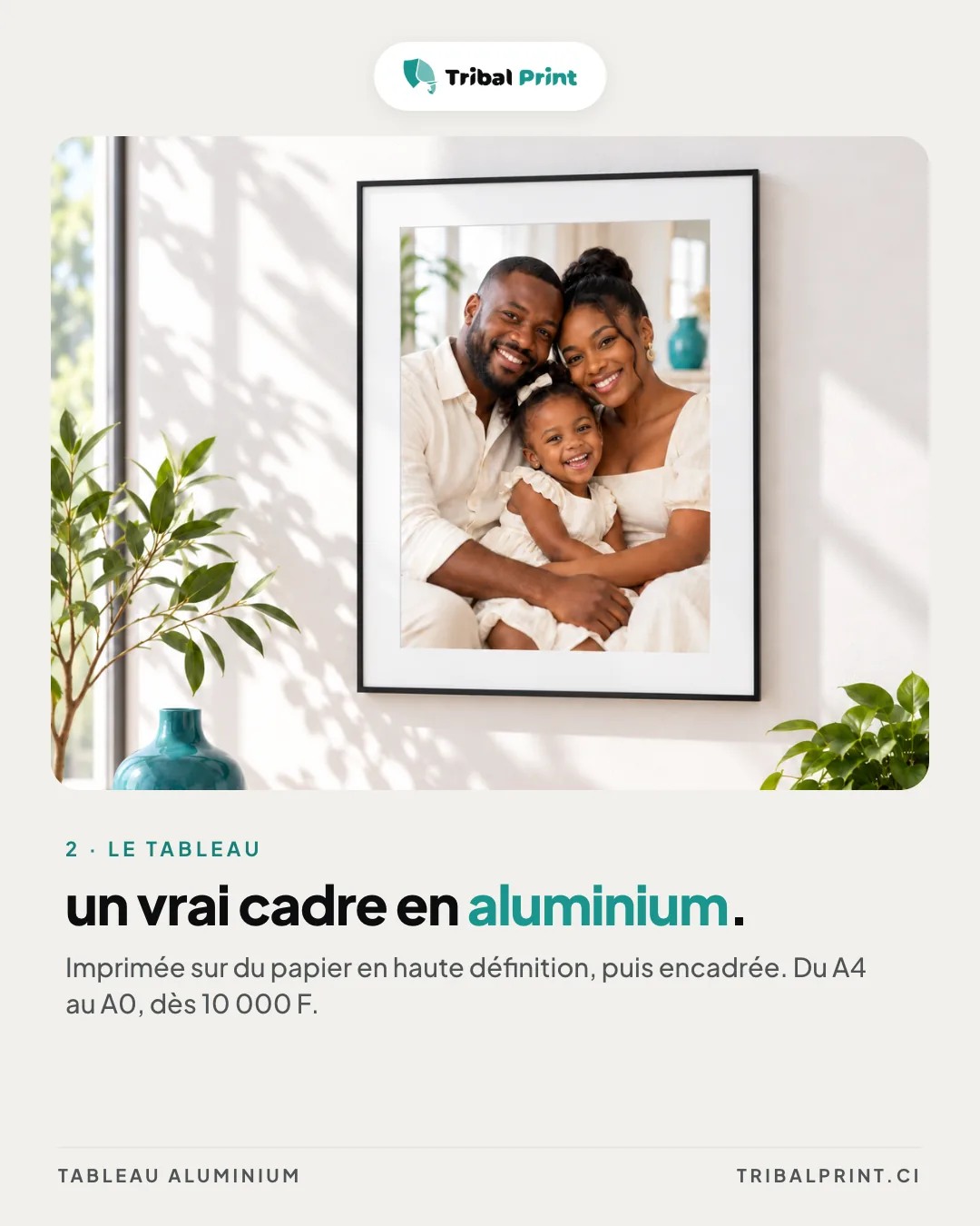
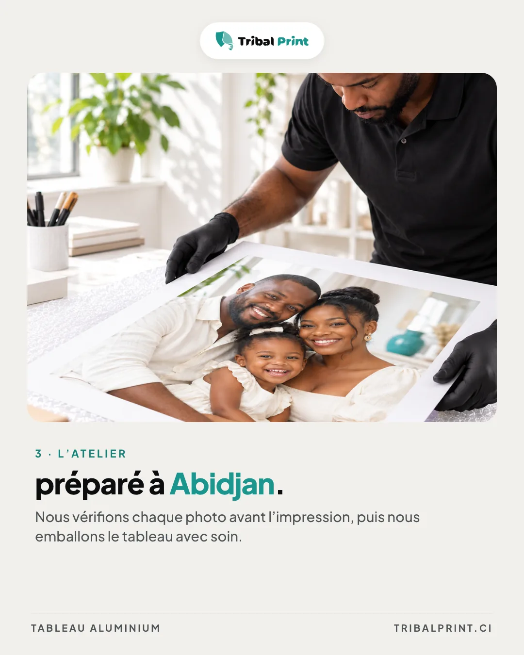
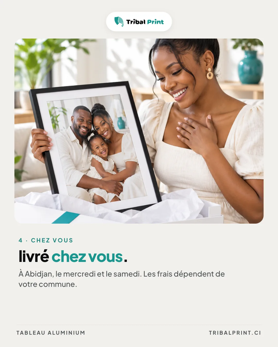
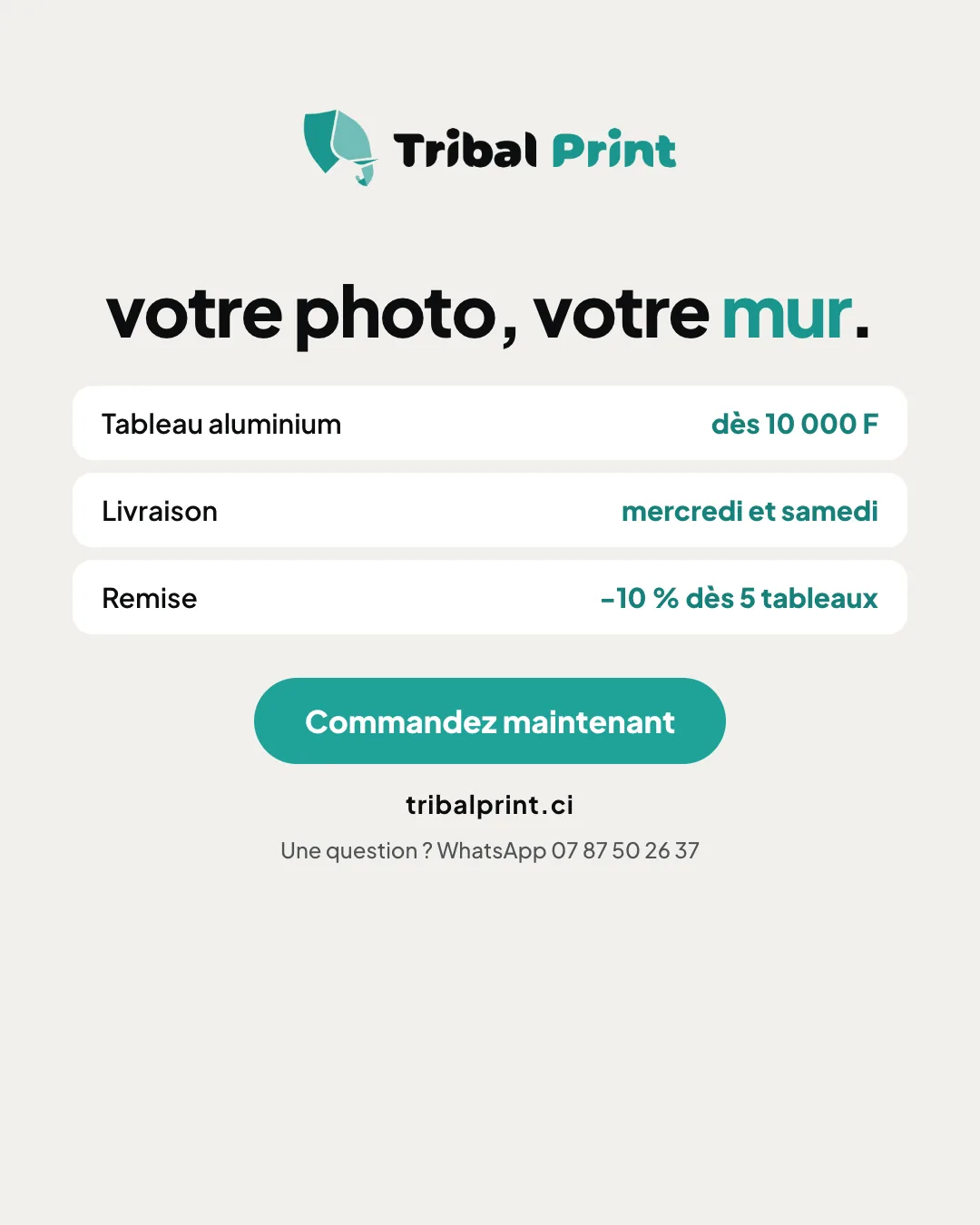
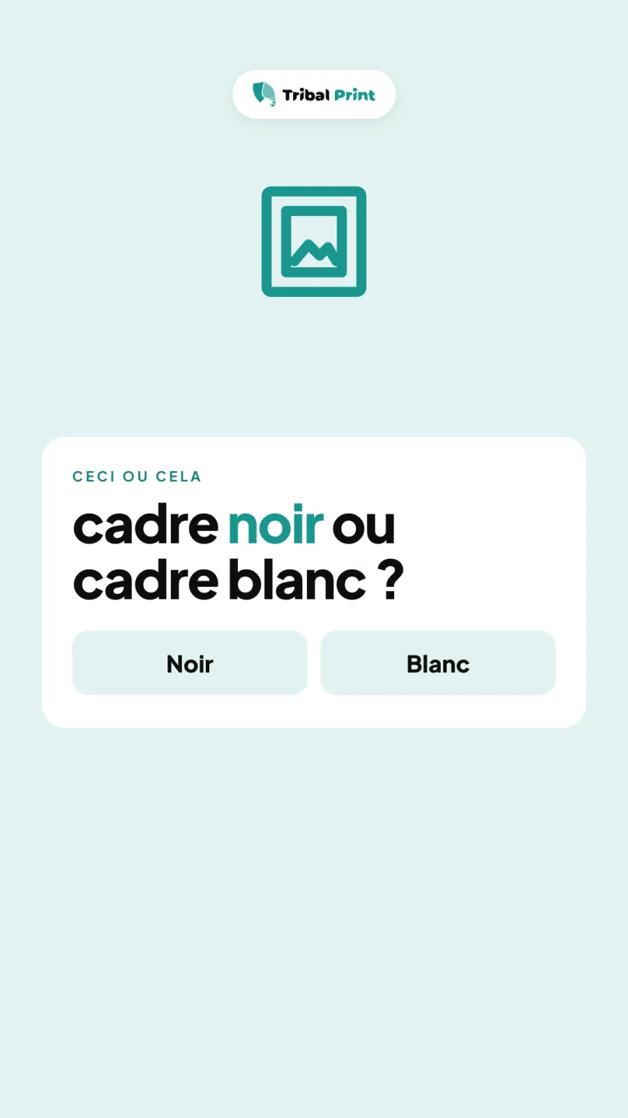
02
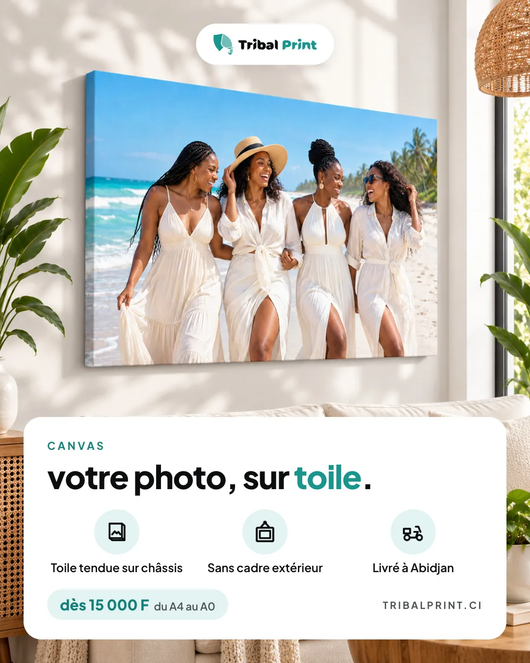
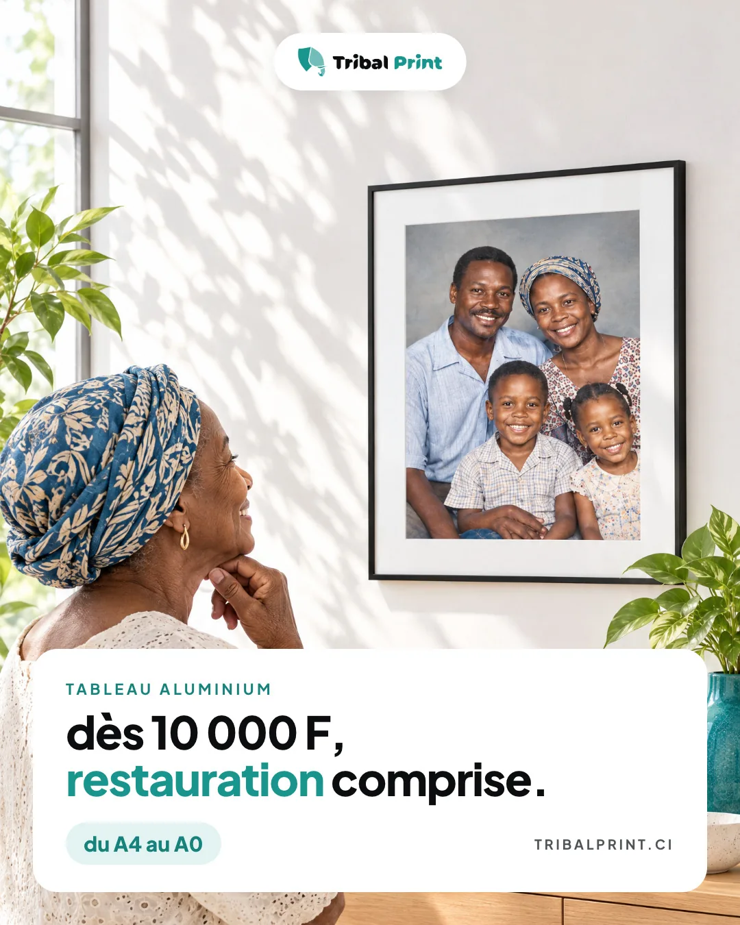
Meta ads in the same design as the website: two images and three videos.
03
The website, the Facebook page and the order email carry the same brand.
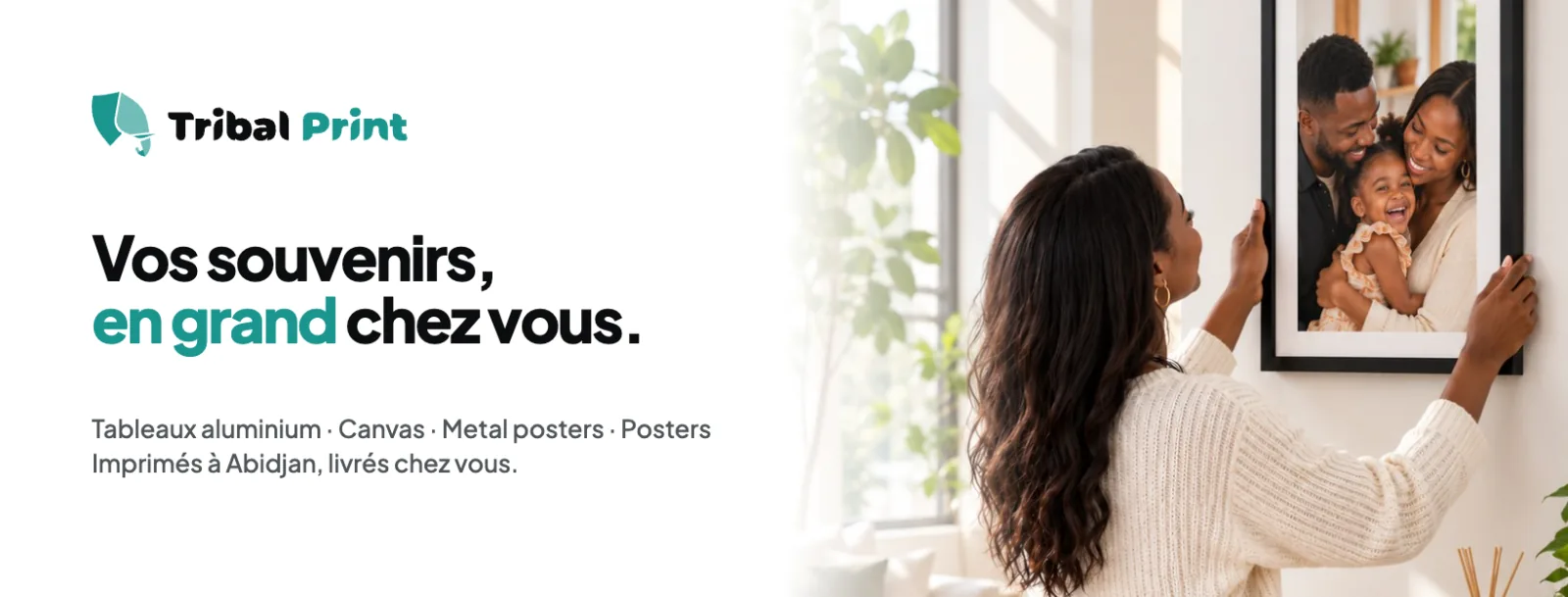
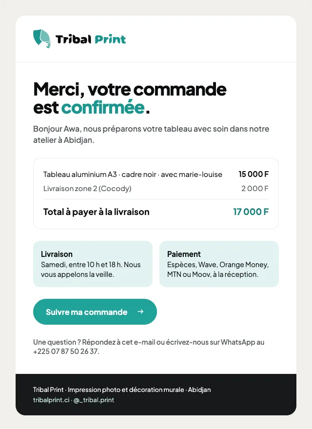
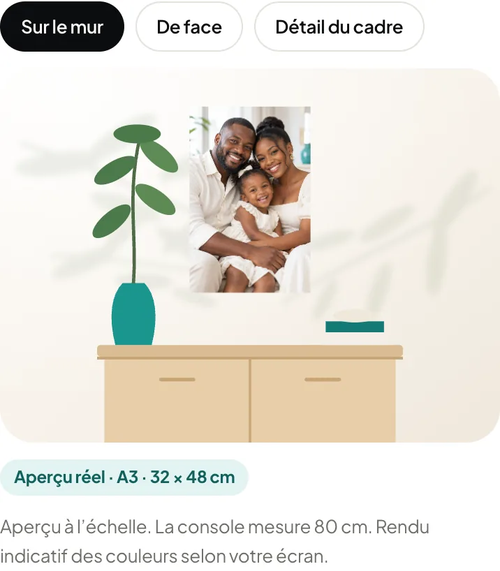
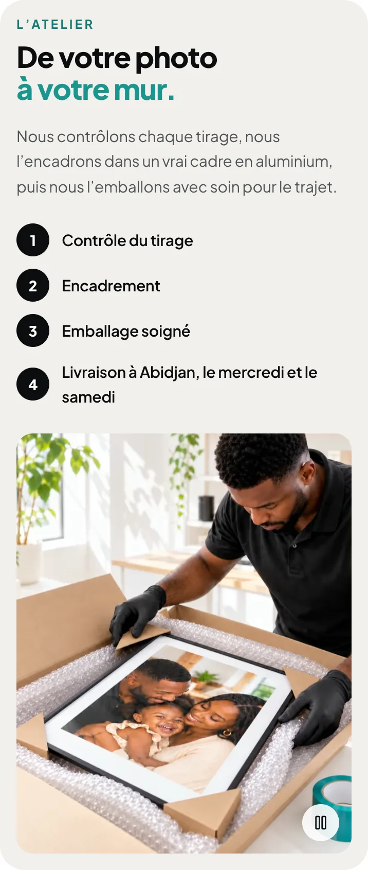
04
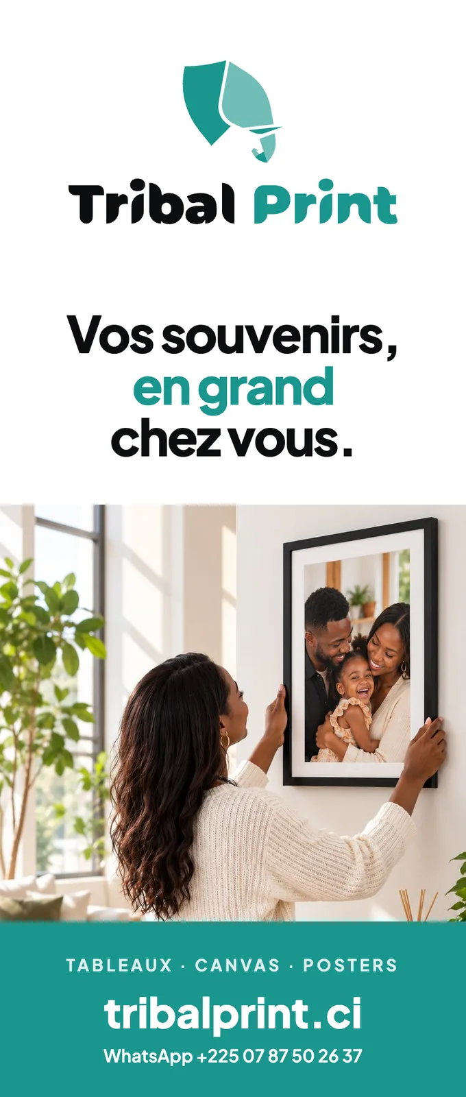
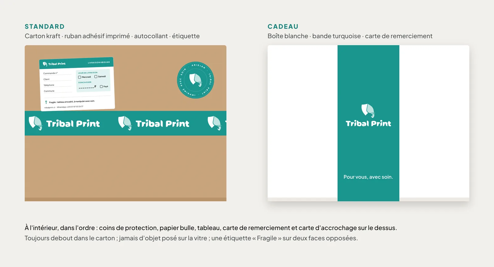
Roll-up, print packaging, thank-you card, hanging card, mug box and workshop sign, all in the same style.
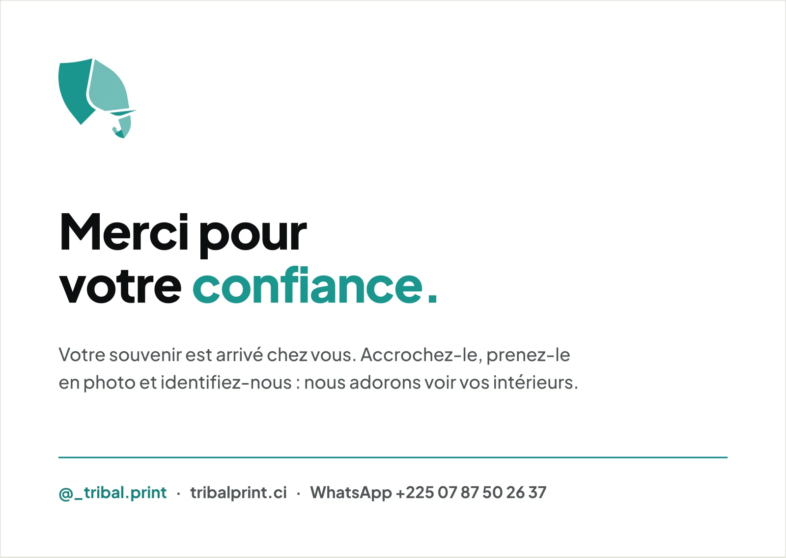
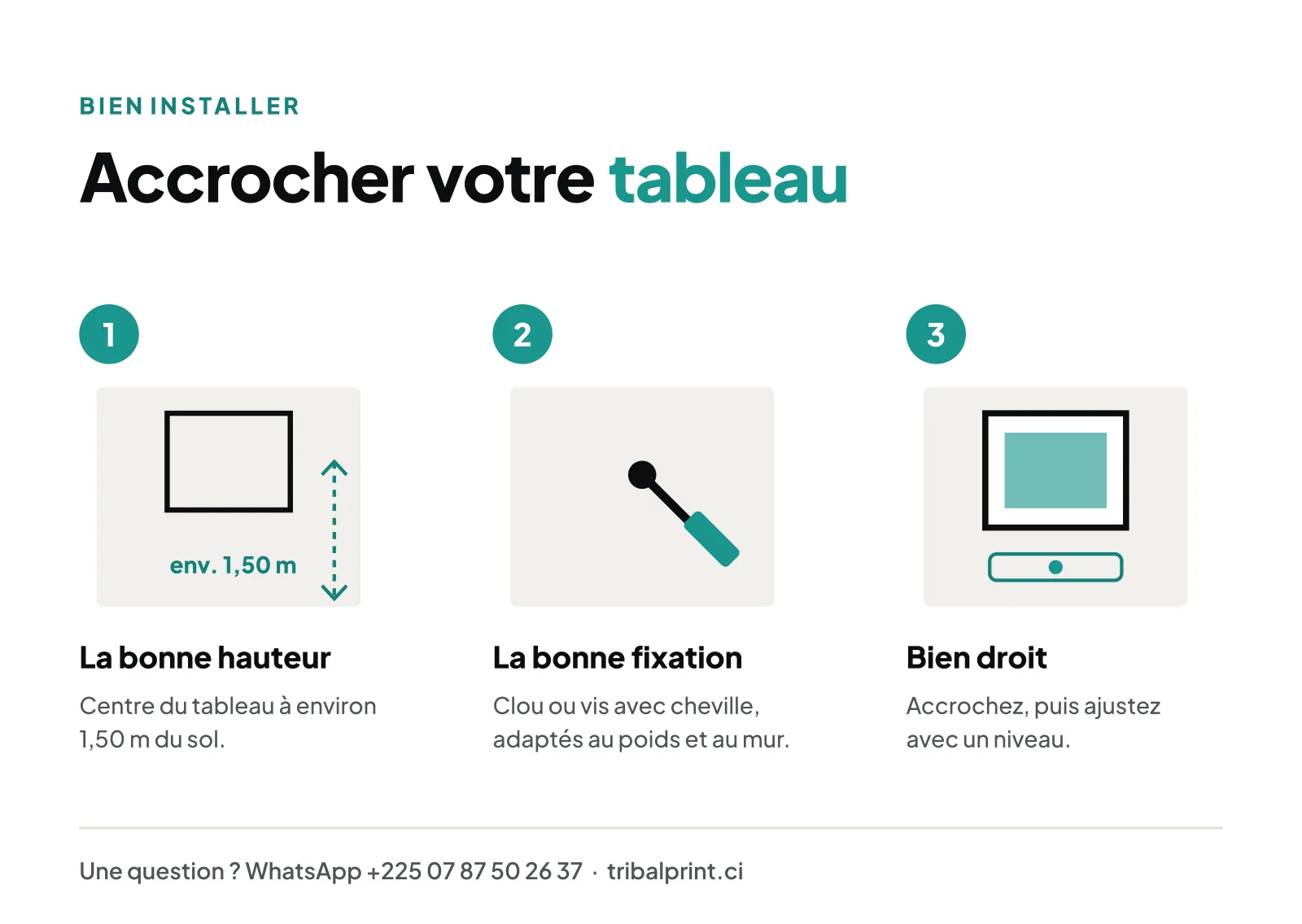
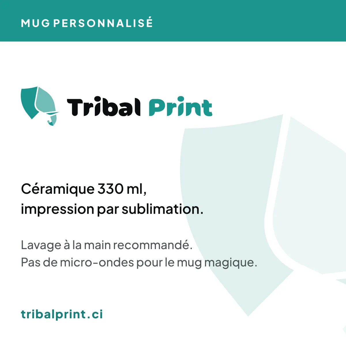
05
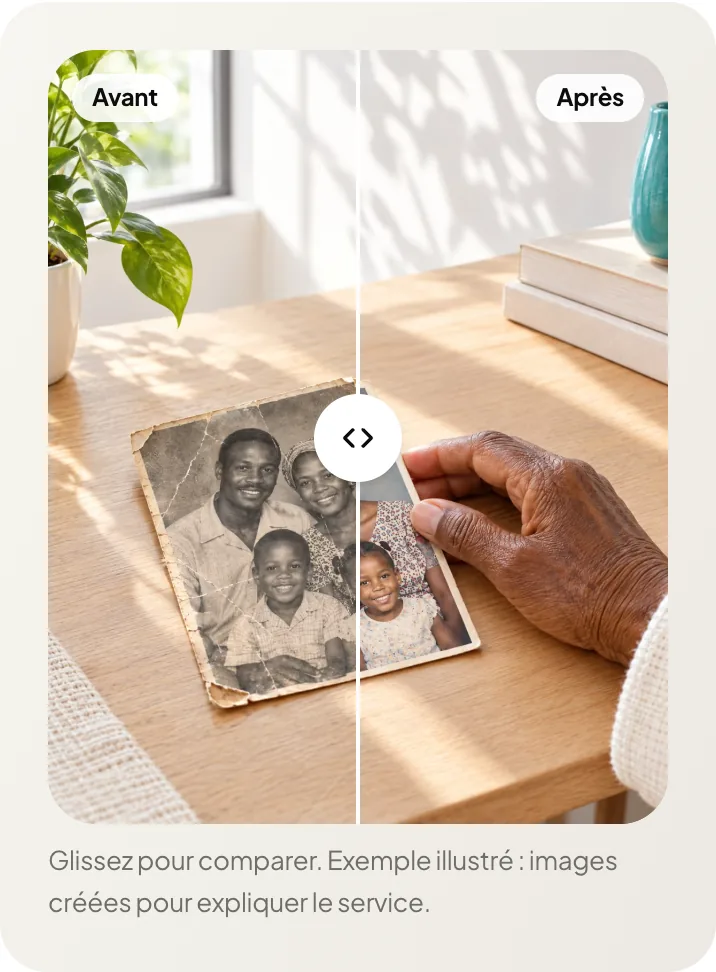
Vertical films for social media: the workshop step by step, the order step by step and the restoration of an old photo.
The videos stay silent until you turn the sound on.
06
An animated logo signature, a framing animation that goes “from phone to wall” and the motion kit: animated titles, transitions, price tags, subtitles and an end card, in the brand’s colours.
07
A sonic logo, the small sounds of the website and brand music.
The sonic logo (2 seconds).
An excerpt of the brand music (20 seconds).
Behind the scenes
The same brand carries over to the team’s tools.
Orders arrive in one place and are followed from purchase to delivery.
The workshop sees what to make and where each piece stands.
Drivers and deliveries are followed on a single screen.
What the brand received
Logo, colours and lettering, gathered in a brand book.
A direction for the visuals: each image is chosen with care before it is used.
An animated signature, a vertical film and shorter versions.
Animations that come back the same everywhere, in the videos and on the website.
A sonic logo, the small sounds of the website and brand music.
A website you can order from on a phone, in several languages.
A management tool for orders, the workshop, deliveries and stock.
Other projects
Skincare, sold in pharmacies
Logo, identity, applications, animated signature and website
See the projectDigital marketing agency, specialised in sport
Logo, identity, four videos and website
See the projectIvorian NGO · young girls and women
Identity, website and admin area
See the projectYour brand next
Tell us about your business. We reply with the next step.